Paint represents the most powerful tool in any homeowner’s decorating arsenal, yet most people approach color selection with the same casual attitude they’d apply to choosing breakfast cereal. The truth is that color wields profound psychological influence over mood, behavior, and even physical health. Understanding these effects can transform your home from a simple shelter into a carefully orchestrated environment that enhances your daily life in measurable ways.
The science behind color psychology isn’t new age mysticism—it’s backed by decades of rigorous research in environmental psychology, neuroscience, and behavioral studies. What researchers have discovered challenges many conventional decorating assumptions while revealing how strategic color choices can improve sleep quality, boost productivity, reduce stress, and even influence social dynamics within your home.
The Neuroscience Behind Color Perception
Human color perception involves far more than simple visual processing. When light wavelengths hit our retinas, they trigger complex neurological responses that affect hormone production, circadian rhythms, and emotional states. Different colors literally cause measurable changes in brain chemistry, heart rate, and blood pressure.
Blue wavelengths, for instance, suppress melatonin production during daylight hours, promoting alertness and focus. This makes blue-based color schemes particularly effective in home offices or study areas. However, excessive blue exposure in bedrooms can interfere with sleep patterns, explaining why many people struggle to rest in rooms painted in bright, cool blues.
Red wavelengths have the opposite effect, stimulating the sympathetic nervous system and increasing arousal levels. While this makes red dining rooms conducive to lively conversation and appetite stimulation, red bedrooms often create restlessness and anxiety. The key lies in understanding these biological responses rather than simply choosing colors based on personal preference.
Dr. Sally Augustin’s research on neuroarchitecture demonstrates that color temperature affects cognitive performance predictably. Cool colors (blues, greens, purples) enhance analytical thinking and concentration, while warm colors (reds, oranges, yellows) promote creativity and social interaction. This knowledge enables homeowners to optimize different rooms for their intended functions.
Cultural Conditioning Versus Universal Responses
While some color responses appear universal, cultural conditioning significantly influences color perception and preference. Western cultures associate white with purity and cleanliness, making white kitchens feel hygienic and spacious. However, in many Asian cultures, white symbolizes mourning, potentially creating subconscious negative associations.
These cultural layers complicate color selection, particularly in multicultural households or when reselling homes in diverse markets. Successful color strategies account for both biological responses and cultural context, finding intersections that work across different backgrounds.
The rise of global design influences through social media has created new hybrid color preferences that blend traditional cultural associations with contemporary aesthetics. Scandinavian hygge aesthetics emphasize muted, natural colors that promote tranquility, while Mediterranean influences favor warm earth tones that encourage social gathering. Understanding these cultural currents helps homeowners make choices that feel both personally meaningful and broadly appealing.
Room-by-Room Color Strategy
Living Rooms: The Social Hub
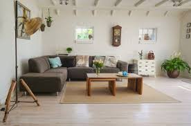
Living rooms serve multiple functions—relaxation, entertainment, conversation—requiring color schemes that balance stimulation with comfort. Warm neutrals like mushroom gray or sage green provide versatile foundations that can be energized with colorful accessories or kept calm for quiet evenings.
Research by the Color Marketing Group shows that living rooms painted in warm grays increase perceived room size by 15% while maintaining cozy intimacy. These colors work particularly well with natural light, appearing cooler in morning sun and warmer in evening lamplight.
Accent walls in deeper colors can create focal points without overwhelming the space. A single wall in navy blue or forest green adds depth and sophistication while allowing the remaining walls to maintain brightness and openness.
Bedrooms: Sleep Optimization
Bedroom color choices directly impact sleep quality, making this the most important room to get right from a health perspective. Cool colors in the blue-green spectrum promote melatonin production and lower heart rates, contributing to faster sleep onset and deeper rest.
However, cool doesn’t mean cold. Dusty blues, sage greens, and lavender grays provide the neurological benefits of cool colors while maintaining visual warmth and comfort. These colors work particularly well when paired with natural wood tones and soft textiles.
Avoid bright whites in bedrooms, as they can create stark, clinical atmospheres that inhibit relaxation. Instead, choose off-whites with warm undertones like cream, ivory, or pearl, which maintain brightness while promoting tranquility.
Kitchens: Energy and Appetite
Kitchen colors should energize without overwhelming, as these spaces require both functional focus and social warmth. Light colors make kitchens feel larger and cleaner, but all-white schemes can feel sterile and show every fingerprint and splash.
Two-tone approaches work particularly well in kitchens. Light upper cabinets paired with darker lower cabinets create visual weight at the bottom while maintaining brightness above. Popular combinations include white uppers with navy lowers, or cream uppers with forest green lowers.
Backsplash colors provide opportunities for personality without commitment. Colorful tiles or painted glass can inject energy and character while remaining easy to change when preferences evolve.
Home Offices: Productivity Enhancement
Home office colors should support the type of work performed in the space. Analytical work benefits from cool colors that enhance concentration—blues, greens, and blue-grays work particularly well. Creative work thrives with warmer colors that stimulate imagination and innovation.
However, avoid overstimulating colors that cause fatigue over long periods. Bright reds or oranges might seem energizing initially but often lead to headaches and irritability during extended work sessions. Instead, choose colors with moderate intensity that can sustain focus without causing strain.
Natural light significantly affects home office color perception. Rooms with northern exposure benefit from warmer colors to counteract cool natural light, while south-facing offices can handle cooler colors that balance intense sun exposure.
The Psychology of Light and Dark
The lightness or darkness of colors (known as “value” in color theory) affects spatial perception and emotional response as much as hue selection. Dark colors absorb light and make spaces feel smaller but more intimate, while light colors reflect light and create expansiveness.
This relationship between color value and spatial perception can be leveraged strategically. Small rooms benefit from light colors that maximize perceived space, while large rooms can handle darker colors that create coziness and definition.
However, the “light colors for small spaces” rule isn’t absolute. Dark colors can actually make small spaces feel larger when used strategically. A small powder room painted in deep navy with good lighting can feel dramatic and sophisticated rather than cramped, as the dark walls seem to recede into shadow.
Sustainable Color Choices
The environmental impact of paint extends beyond VOC content to include color longevity and trend resistance. Choosing colors that age gracefully reduces the need for frequent repainting, minimizing environmental impact and long-term costs.
Classic color combinations—navy and white, forest green and cream, charcoal and beige—tend to remain appealing longer than trendy combinations that quickly feel dated. These timeless palettes also provide better resale value, as they appeal to broader buyer demographics.
Natural pigments and earth-based colors often age more gracefully than synthetic hues. Colors inspired by natural materials—stone, wood, metals—tend to feel authentic and enduring rather than artificial and temporary.
Technology’s Impact on Color Selection
Digital displays and LED lighting have fundamentally changed how we experience color in homes. Colors that looked perfect under incandescent bulbs may appear flat or garish under LED lighting. This shift requires new approaches to color selection that account for modern lighting technologies.
LED bulbs come in various color temperatures, from warm (2700K) to cool (5000K). The same wall color can appear dramatically different under different LED temperatures, making it crucial to test colors under intended lighting conditions rather than relying solely on paint store samples.
Smart lighting systems that adjust color temperature throughout the day offer new possibilities for color interaction. Walls that look energizing under cool morning light can transform to feel cozy under warm evening settings, maximizing the psychological benefits of both color and lighting.
Implementation Strategies for Color Success
Test Extensively Before Committing
Paint large swatches (at least 2×3 feet) and observe them under different lighting conditions and times of day. Colors that look perfect in afternoon sun may appear completely different under morning light or evening lamps.
Consider the 60-30-10 Rule
This classic interior design principle suggests using a dominant neutral color for 60% of the space, a secondary color for 30%, and a bold accent color for 10%. This creates balance while allowing for personality and interest.
Account for Existing Elements
Consider immovable elements like flooring, countertops, and fixtures when selecting colors. The most beautiful paint color will look terrible if it clashes with existing materials that can’t be easily changed.
Plan for Longevity
Choose colors you’ll enjoy living with for several years. While accent walls and accessories can change easily, main wall colors represent significant time and expense to modify.
The psychology of color offers a scientific approach to creating homes that actively support wellbeing, productivity, and happiness. By understanding how colors affect mood, behavior, and health, homeowners can make strategic choices that transform their living spaces from merely functional to genuinely therapeutic. The investment in thoughtful color selection pays dividends in daily quality of life, making this one of the most impactful improvements any homeowner can make.